
This series of tests began with a collection of pigments inherited from my late father, once used for tempera painting. Their origins were uncertain: some mineral, some organic, some industrial. I wanted to understand how they behave in a ceramic context: what transforms, what resists, and what disappears in heat.
Each pigment was tested in small batches. First, fired on a piece of metal foil to see if it could stand heat. Then, mixed either into a transparent glaze or combined with wild glazes made from ash and local clays. The tests were not only technical but observational. They were a way of re-establishing contact with materials, of learning through the quiet dialogue between substance and fire.
Some pigments dissolved and revealed new depths of colour. Others burned away, leaving only a trace of carbon. Together, they map the boundary between painting and ceramics — between colour carried by light, and colour held by minerals.
Reflection – Testing Cobalt in Two Glazes
This test explored how the same pigment behaves in two different glaze bases. I mixed cobalt into a transparent glaze on one half of the test piece, and into a white glaze called Ivory on the other. Both were fired on a white clay body under the same conditions.
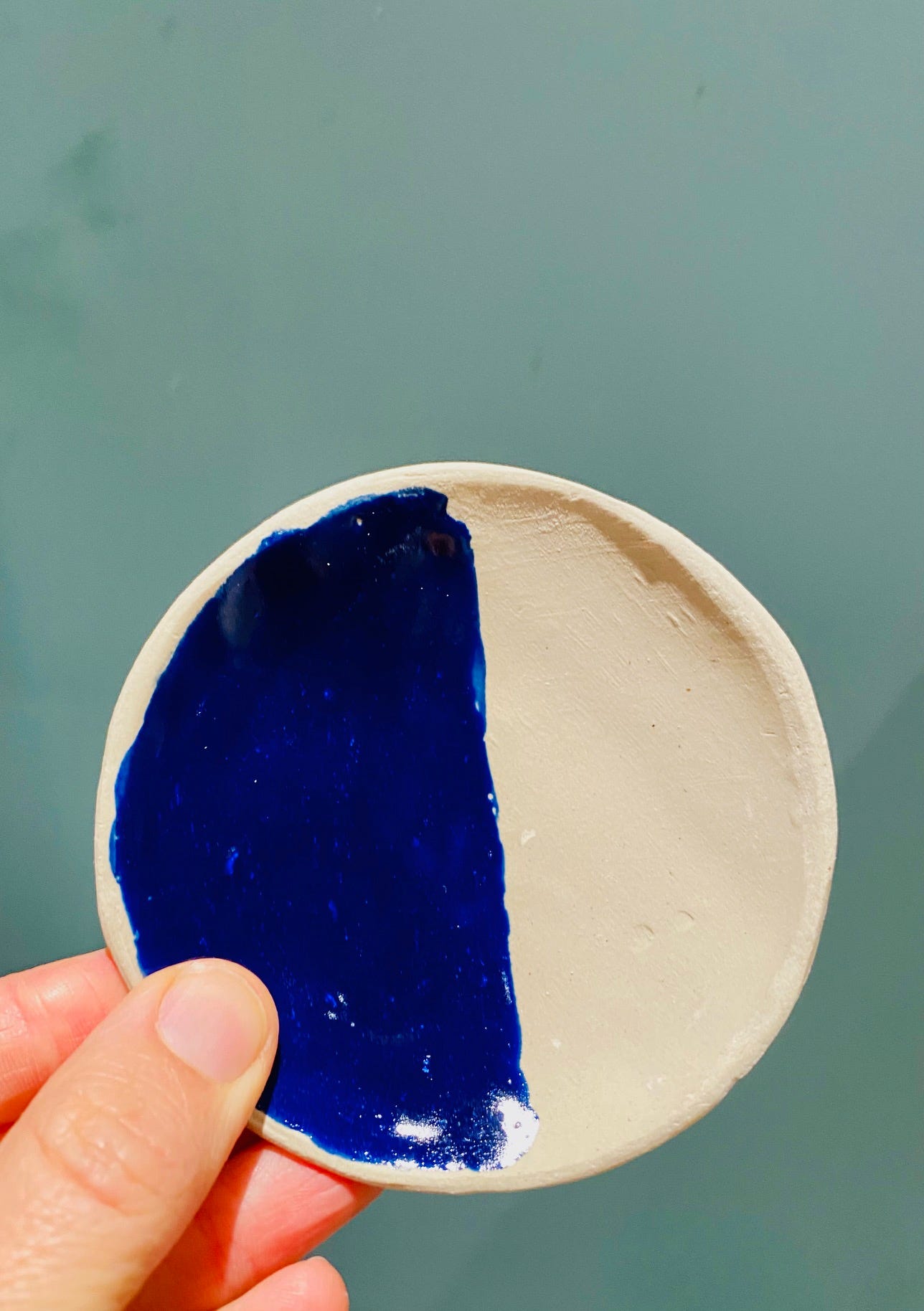
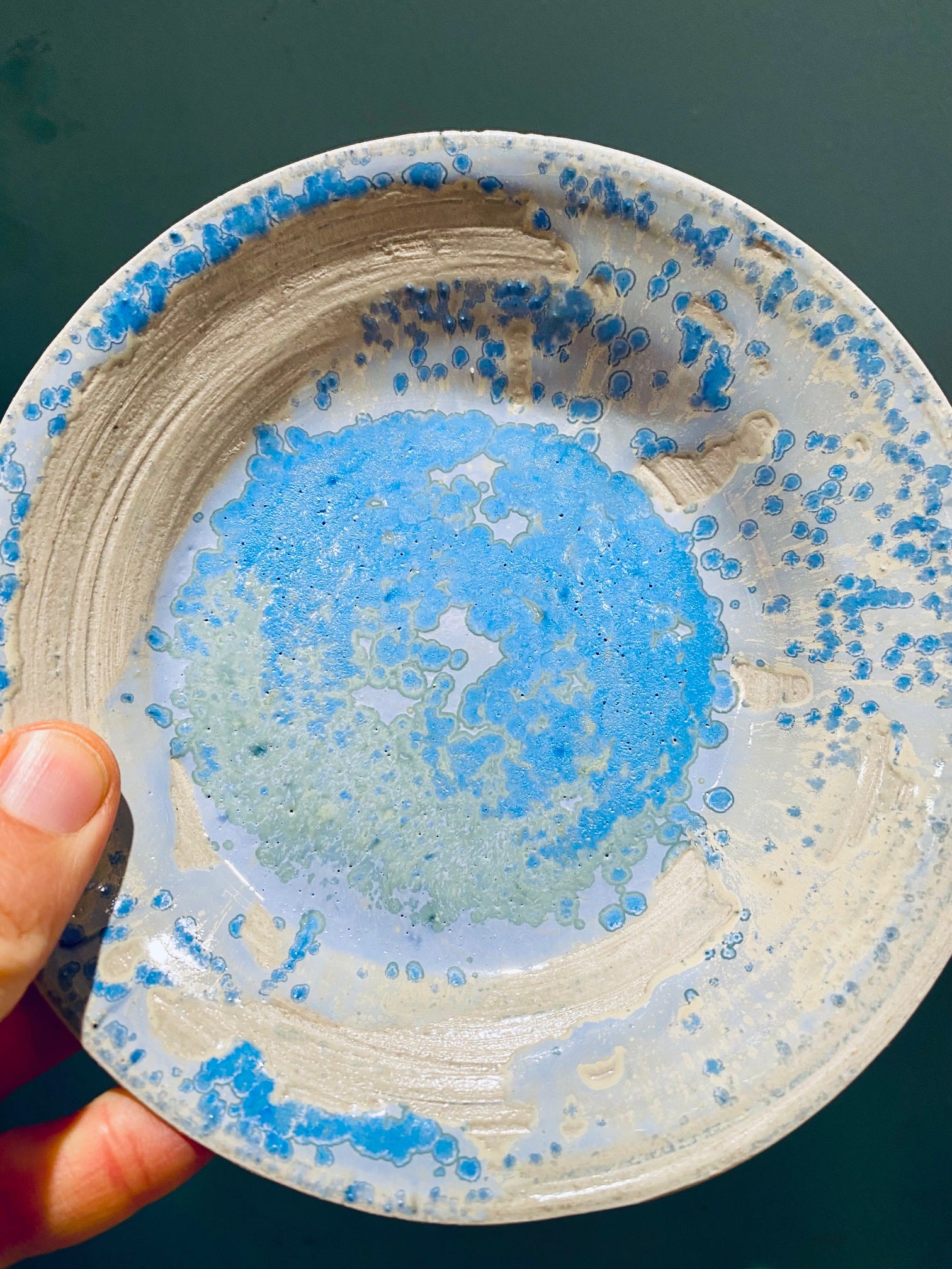
In the transparent glaze, cobalt dissolved completely and produced a deep, even blue. A pure, saturated tone that reveals the clarity of the pigment itself. In the ivory glaze, the colour separated into halos of blue and green, forming a mottled surface where the pigment interacted with the glaze chemistry.
The contrast between the two demonstrates how colour is not a fixed property but a negotiation between elements. Cobalt is precise yet reactive; it responds to the chemistry around it. What appears controlled in one context becomes expressive in another.
Reflection – Testing Ultramarine Blue
Ultramarine blue was tested for stability by heating a small amount on aluminium foil. The pigment produced light smoke and quickly lost its colour. It did not survive firing.
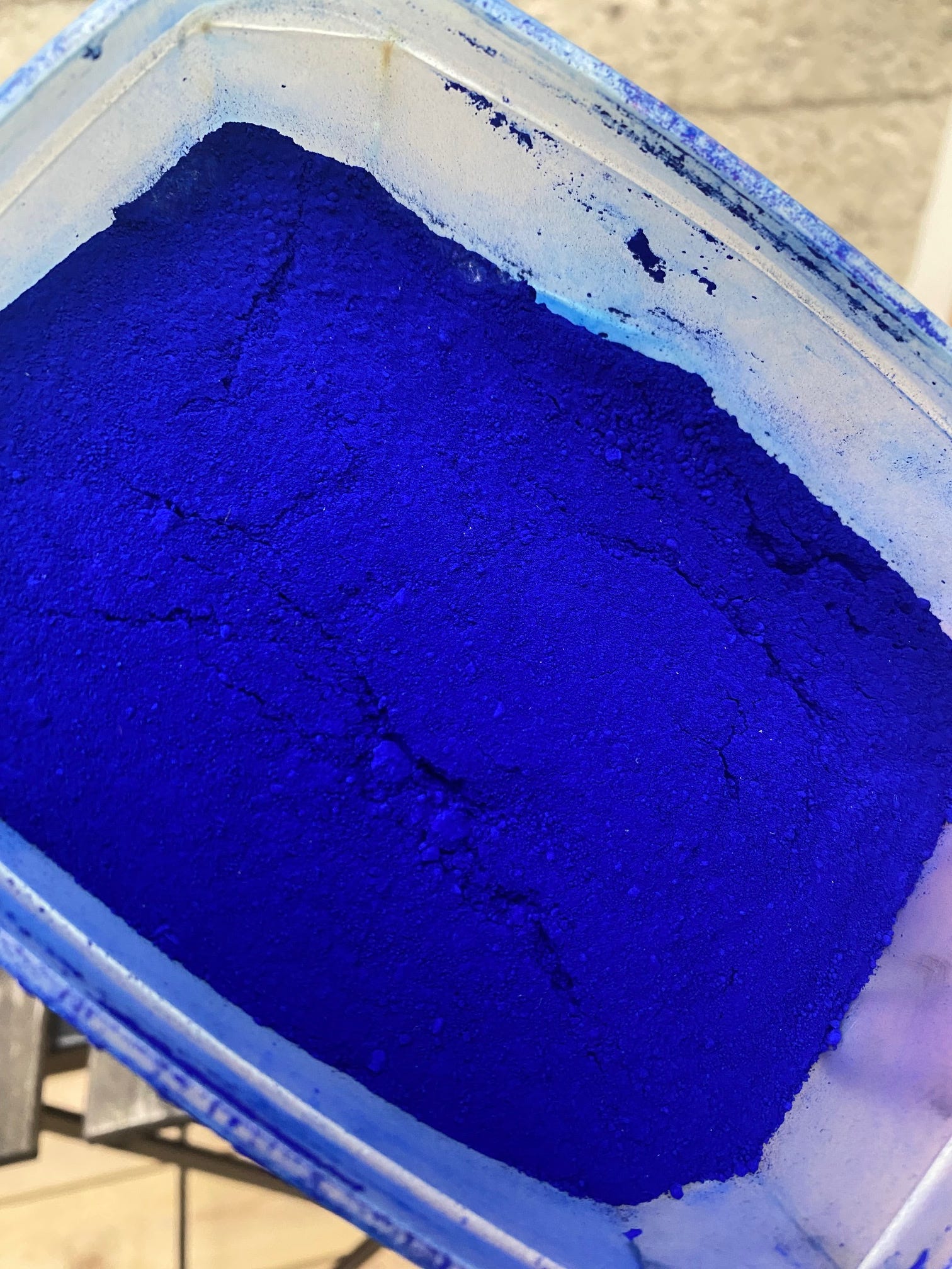
Ultramarine is a synthetic pigment made from sodium silicate and sulphur. In paint it gives a clear, luminous blue, but in ceramics it burns away, leaving only a pale residue. The test revealed the limits of temperature: some colours belong to air and light, not to fire.
Even failed tests contain information. This one shows where transformation ends: where the material refuses to continue the journey into heat.
Reflection – Testing Madder Lake
Madder lake was tested by heating a small sample on aluminium foil. It smoked and turned black before burning away completely, leaving no trace of colour. The pigment is organic, derived from the roots of Rubia tinctorum, and cannot withstand high temperatures.
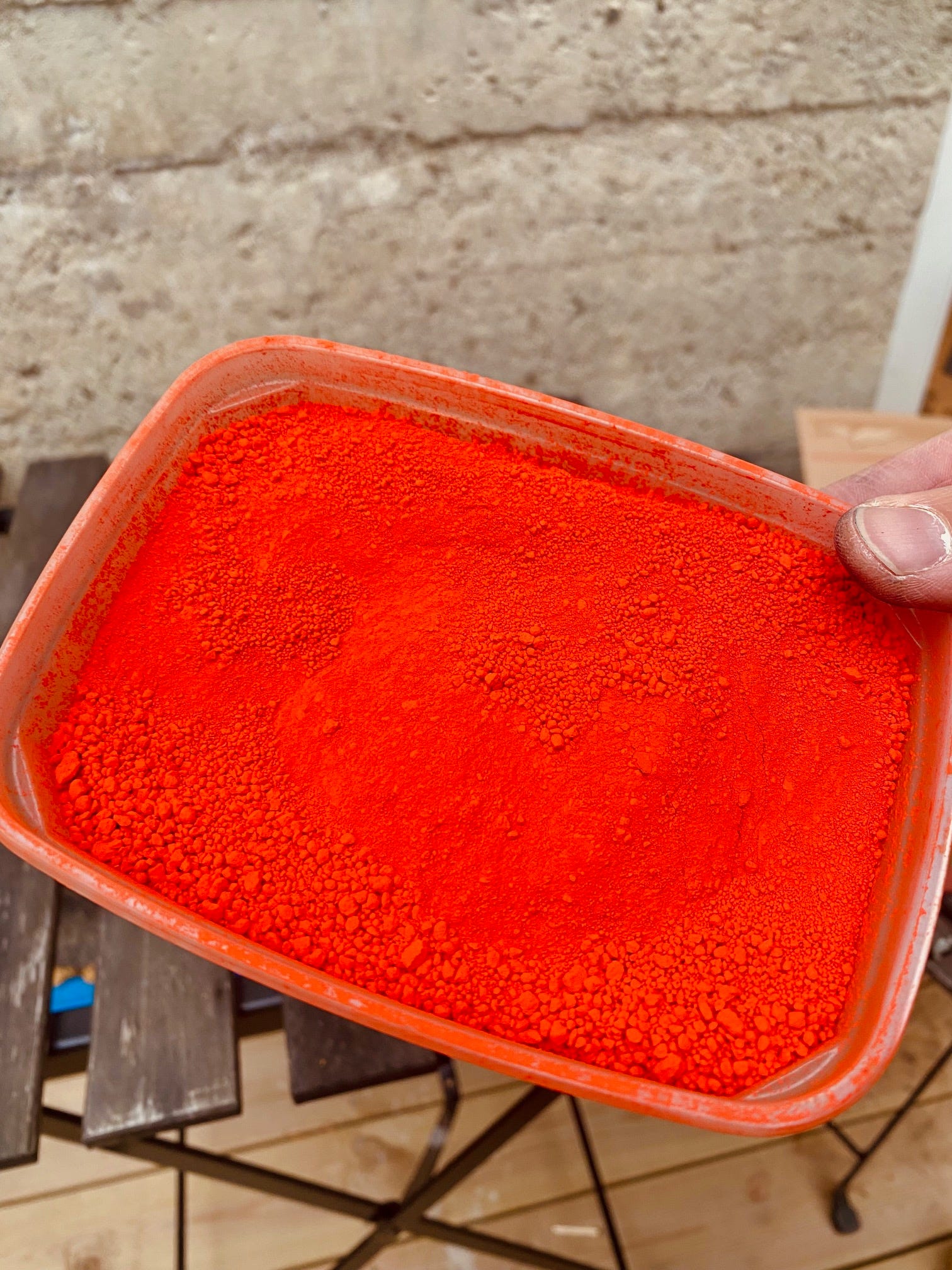
In paint, madder is valued for its warmth and transparency, but in the kiln it simply disappears. This test marks a boundary between disciplines: where colour as image ends, and colour as mineral begins.
Reflection on Light Ochre in a wild glaze
This test combines light ochre with a wild glaze made from birch ash and local clays collected in Asker (Norway) and Louns (Denmark). The glaze was applied to a crank clay body and fired in oxidation.
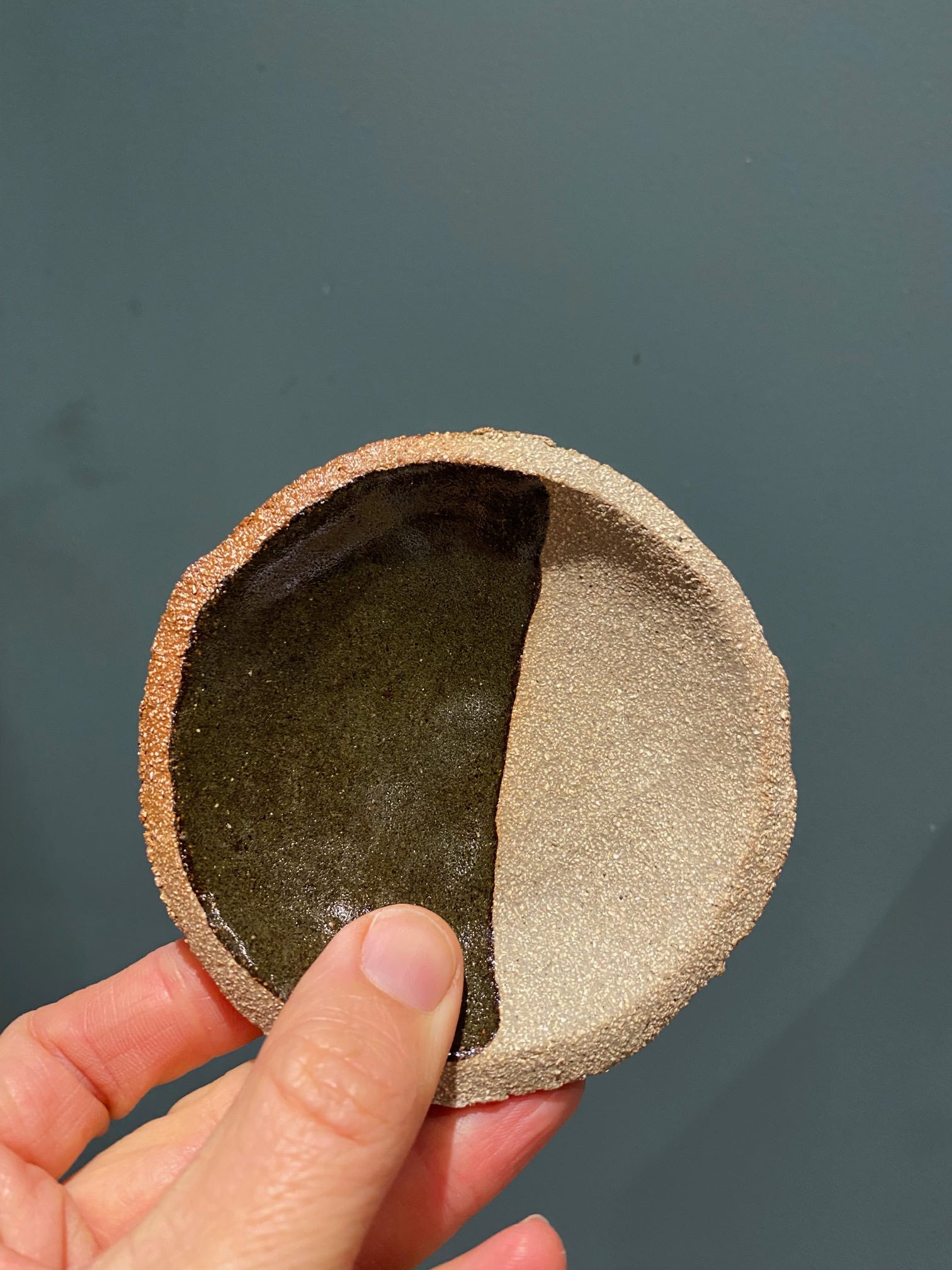
The result appears almost identical to the unmodified wild glaze: a deep olive surface with metallic undertones. The addition of ochre made little visible difference. The reason lies in chemistry: both the wild glaze and the pigment are already rich in iron, and the dark clay body further absorbs the colour. The ochre dissolves into the system rather than asserting itself.
What seems at first like a failed test becomes a reminder. Some glazes already contain all the elements they need. Adding more does not enrich them; it simply disappears into what is already present.
Reflection on Terra Brown
This test combines the pigment Terra Brown with a transparent glaze on a coarse crank clay body. The aim was to observe how a darker, iron- and manganese-rich earth pigment behaves compared to the lighter ochres tested earlier.
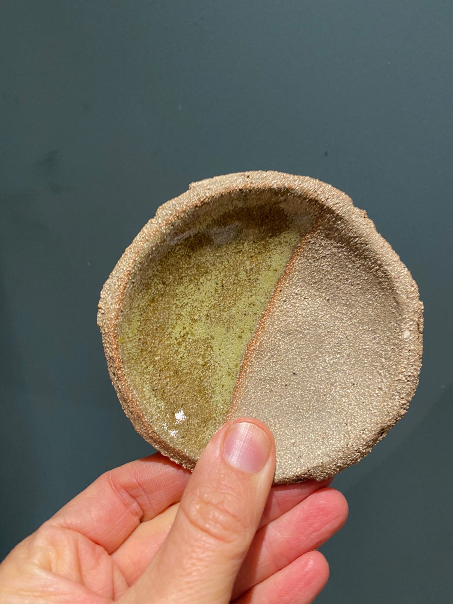
After firing, the surface developed a warm, amber-brown tone with olive undertones. In areas where the glaze pooled, the colour deepened and became slightly metallic, while thinner areas remained translucent and golden. The granular texture of the clay intensified the pigment’s earthy character, allowing the glaze to settle unevenly across the surface.
Reflection on Light Ochre
This test was made by mixing light ochre pigment into a transparent glaze and applying it to a white clay body. I expected a pale yellow tone, but after firing the colour shifted towards olive and amber. The transformation reveals how iron behaves in heat: what begins as yellow earth becomes red and brown through oxidation, and when suspended in a molten glaze it turns translucent, caught somewhere between green and gold.
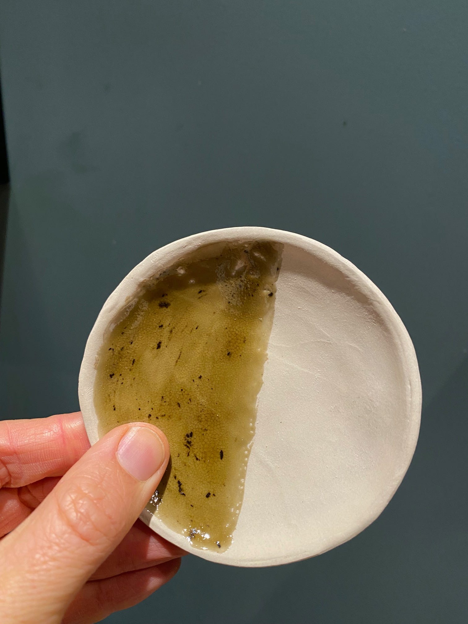
The surface shows tiny specks where the pigment has not fully dissolved. These are remnants of the mineral itself, traces of clay, sand and iron that resist melting or should have been sieved better.
Reflection on Verona Green
This test was made to identify an old green pigment found among inherited tempera colours. The powder had a pale turquoise hue, but its composition was uncertain, possibly a copper-based pigment or a natural green earth. I mixed a small amount into a transparent glaze and applied it to a white clay body.
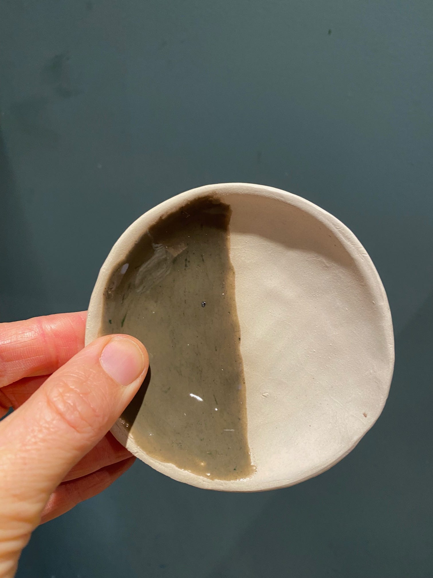
After firing, the colour turned into a muted olive grey rather than the expected turquoise. The surface remained smooth and stable, without signs of melting or fluxing. This behaviour suggests that the pigment is not copper carbonate, but a mineral green earth — celadonite or glauconite — a naturally occurring iron and manganese silicate.
Summary
These tests were carried out to understand how different pigments behave when exposed to ceramic firing temperatures. The aim was to identify which pigments survive the kiln, how they interact with different glaze bases, and what kinds of colour transformations occur. The work focused on simple, repeatable tests: half-glazed samples on white and crank clay, fired in oxidation.
The results show clear differences between organic and mineral pigments.
Organic pigments such as madder lake and ultramarine burn away completely.
Mineral pigments based on iron, manganese, copper, and cobalt remain stable, though they change character depending on glaze chemistry and clay body.
Earth pigments such as ochres and terra brun give muted, warm tones that vary with the iron content of the glaze.
Cobalt stands out as the most intense and consistent colourant.
Overall, the series provides a basic map of how traditional tempera pigments respond to heat. For me, it works as a practical reference for developing glazes that integrate both natural and found materials.